The city of Vancouver, located on the west coast of Canada, is renowned for its stunning natural landscapes, diverse culture, and thriving design scene. When it comes to interior design, Vancouver homeowners and designers often draw inspiration from the city’s picturesque surroundings, resulting in unique and captivating spaces. In this article, we will explore the color trends that have emerged in Vancouver’s interior design, ranging from serene blues that evoke a sense of tranquility to vibrant accents that add energy and personality to living spaces.
Serene Blues: Bringing the Outdoors In
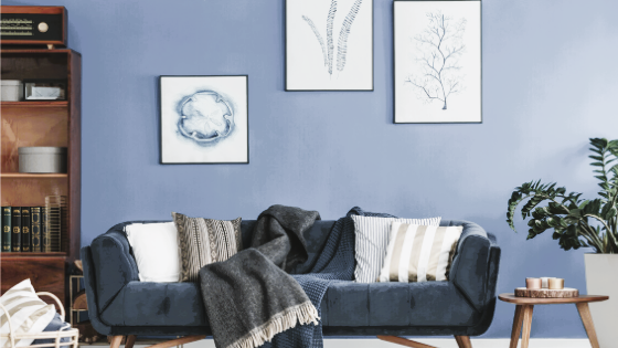
Vancouver’s close proximity to the Pacific Ocean and mountain ranges has a profound influence on the choice of colors in interior design. Serene blues, reminiscent of the ocean and sky, are a popular choice for creating a calm and soothing atmosphere. From soft pastel shades to deep navy hues, blue tones can be incorporated through various elements, such as walls, furniture, and accessories.
Pale blue walls provide a refreshing backdrop and can make a room feel open and airy. They pair well with light-colored furniture and natural materials like wood or rattan, further enhancing the connection to nature. Deep blue accents, such as throw pillows, rugs, or artwork, add depth and create focal points within a space. These accents can be complemented by metallic finishes in silver or gold, adding a touch of elegance and sophistication.
Neutral Foundations: Timeless Elegance
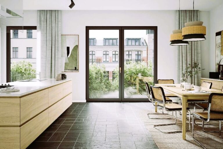
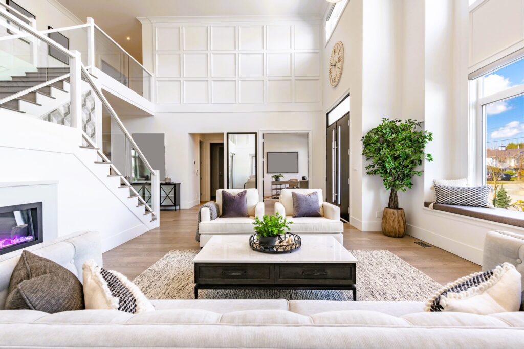
In Vancouver’s interior design, neutral colors serve as a versatile foundation that allows for flexibility and personalization. Shades of white, beige, and gray dominate the color palette, providing a backdrop that can be easily complemented by a wide range of accent colors and textures. These neutral tones create a sense of timeless elegance and work well in both modern and traditional settings.
Neutral walls create a clean and fresh look, while neutral furniture pieces provide a sense of sophistication and simplicity. They allow homeowners to experiment with different color schemes and easily change the mood of a space by adding or swapping out accent pieces. Do you want a beautiful interior for a cafe, restaurant? Check out our article on Designing Social Spaces.
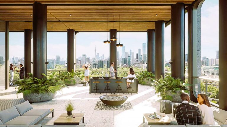
Vibrant Accents: Adding Personality and Energy
While serene blues and neutral tones dominate Vancouver’s interior design, vibrant accent colors are used strategically to add personality and energy to living spaces. Splashes of bold and saturated colors, such as vibrant oranges, yellows, and greens, can be introduced through accessories, artwork, and statement furniture pieces.
These vibrant accents serve as focal points, injecting a sense of liveliness and playfulness into the overall design. They can be incorporated through decorative pillows, area rugs, or eye-catching art pieces. Vibrant accent colors are particularly popular in spaces like living rooms, where they create a vibrant and inviting atmosphere for socializing and entertaining.
Standardization and Guidelines
In Canada, various organizations play a role in setting standards and guidelines for interior design, ensuring that spaces are designed with safety, functionality, and accessibility in mind. The Canadian Home Builders’ Association (CHBA) and the Interior Designers of Canada (IDC) are two such organizations that provide guidelines and resources for professionals in the field.
The CHBA focuses on home design and construction, while the IDC provides resources and promotes excellence in interior design. These organizations establish standards for aspects such as lighting, material selection, and space planning, ensuring that design choices are made with the well-being and comfort of occupants in mind.
Conclusion
Color trends in Vancouver’s interior design reflect the city’s unique blend of natural beauty and cultural diversity. Serene blues bring a sense of tranquility and connection to the outdoors, while neutral foundations provide timeless elegance and versatility. Vibrant accents inject personality and energy into living spaces, creating focal points that catch the eye. By incorporating these color trends thoughtfully, homeowners and designers in Vancouver can create captivating and harmonious interiors that reflect their individuality while adhering to established standards and guidelines.
References:
- Canadian Home Builders’ Association (CHBA): link